
Table of Contents
Something I always enjoy about Maison&Objet is seeing how interiors and homewares continue to evolve, while also noticing the timeless elements I find myself drawn to again and again. The fair offers a wonderful insight into the colours, materials, craftsmanship and decorative influences beginning to shape the seasons ahead.
For Autumn/Winter 2026–27, the overall direction felt tactile, soulful and increasingly expressive. The quieter, pared-back interiors of recent years are becoming richer and more layered, with natural materials sitting alongside deeper, saturated colours, decorative patterns and sculptural forms.
There was also a noticeable return to interiors with a blend of influences. Rather than everything belonging to one style, period or collection, rooms felt more confidently assembled through contrast: old and new, polished and imperfect, decorative and restrained.
These were some of the ideas that stood out most to us.
1. A Celebration of Craft
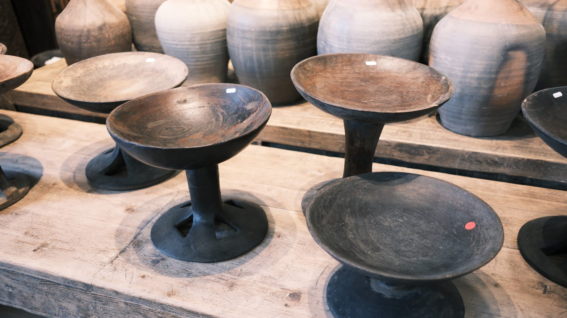
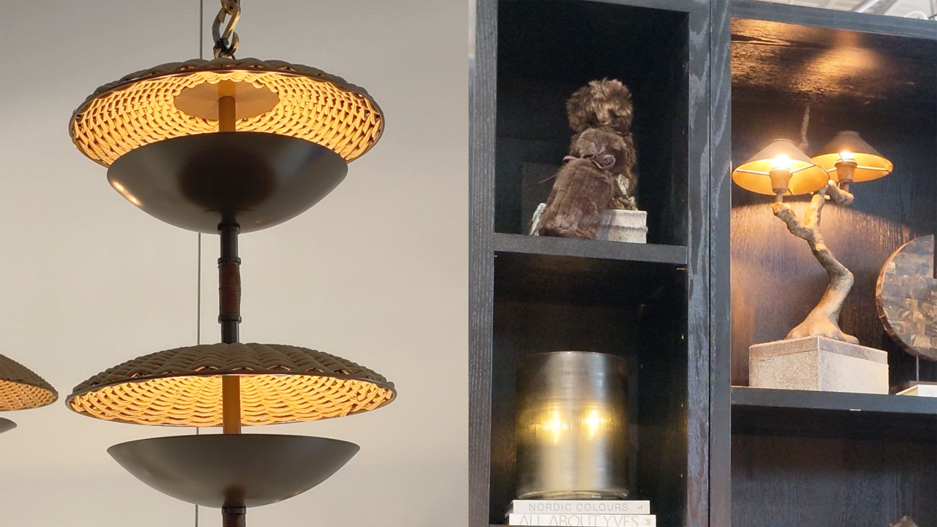
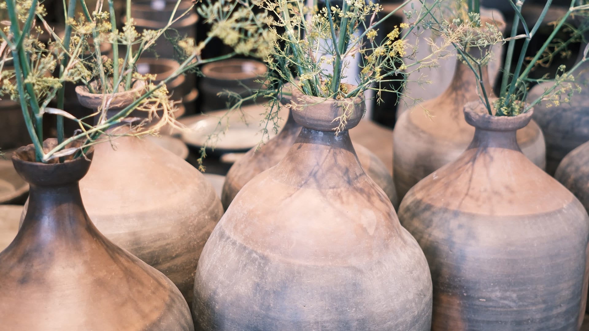
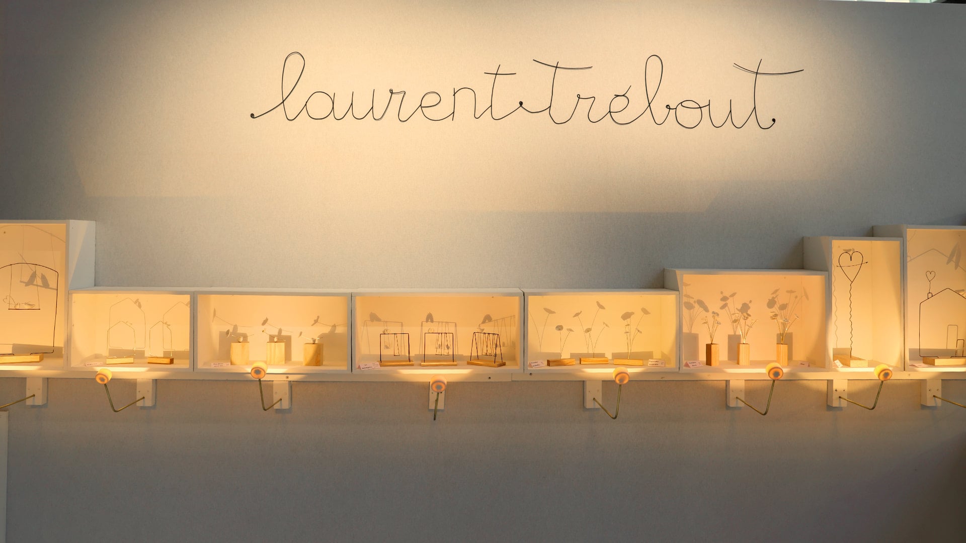
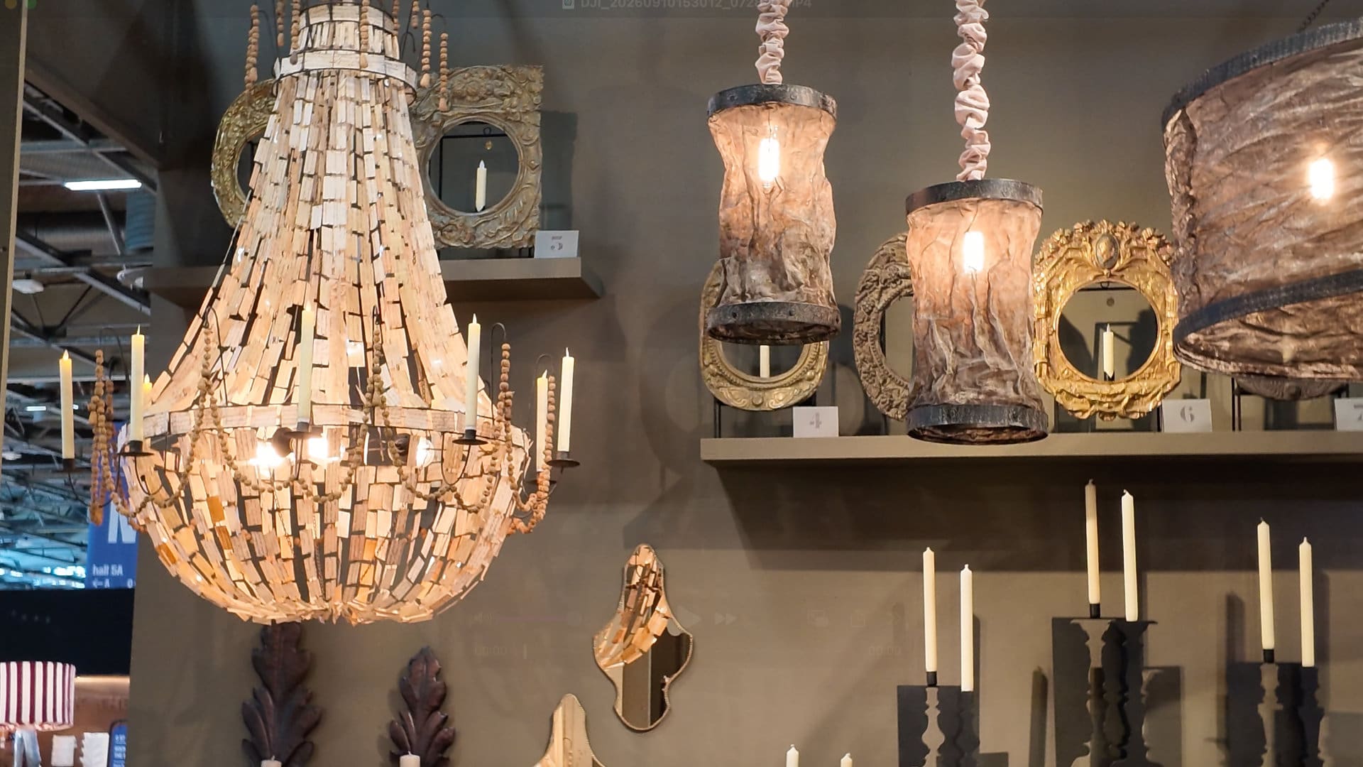
Craftsmanship was one of the strongest threads running through the fair, with hand-blown glass, individually glazed ceramics, woven fibres, sculptural lighting and beautifully worked natural materials appearing throughout.
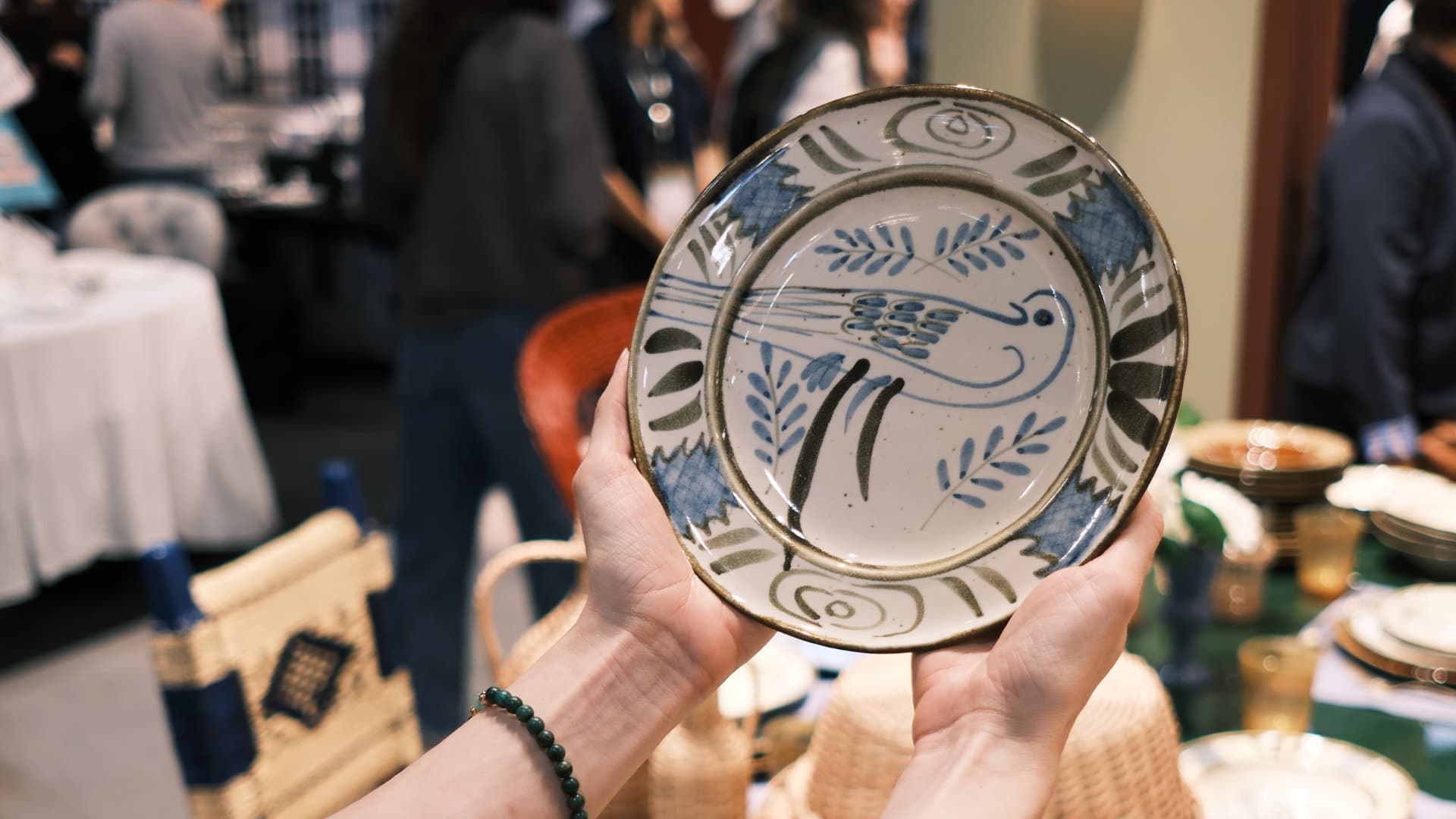
What made these pieces particularly appealing was their individuality. Slight differences in glaze, texture, colour and form were not disguised; they were part of the object's character and a reminder of the process behind it.
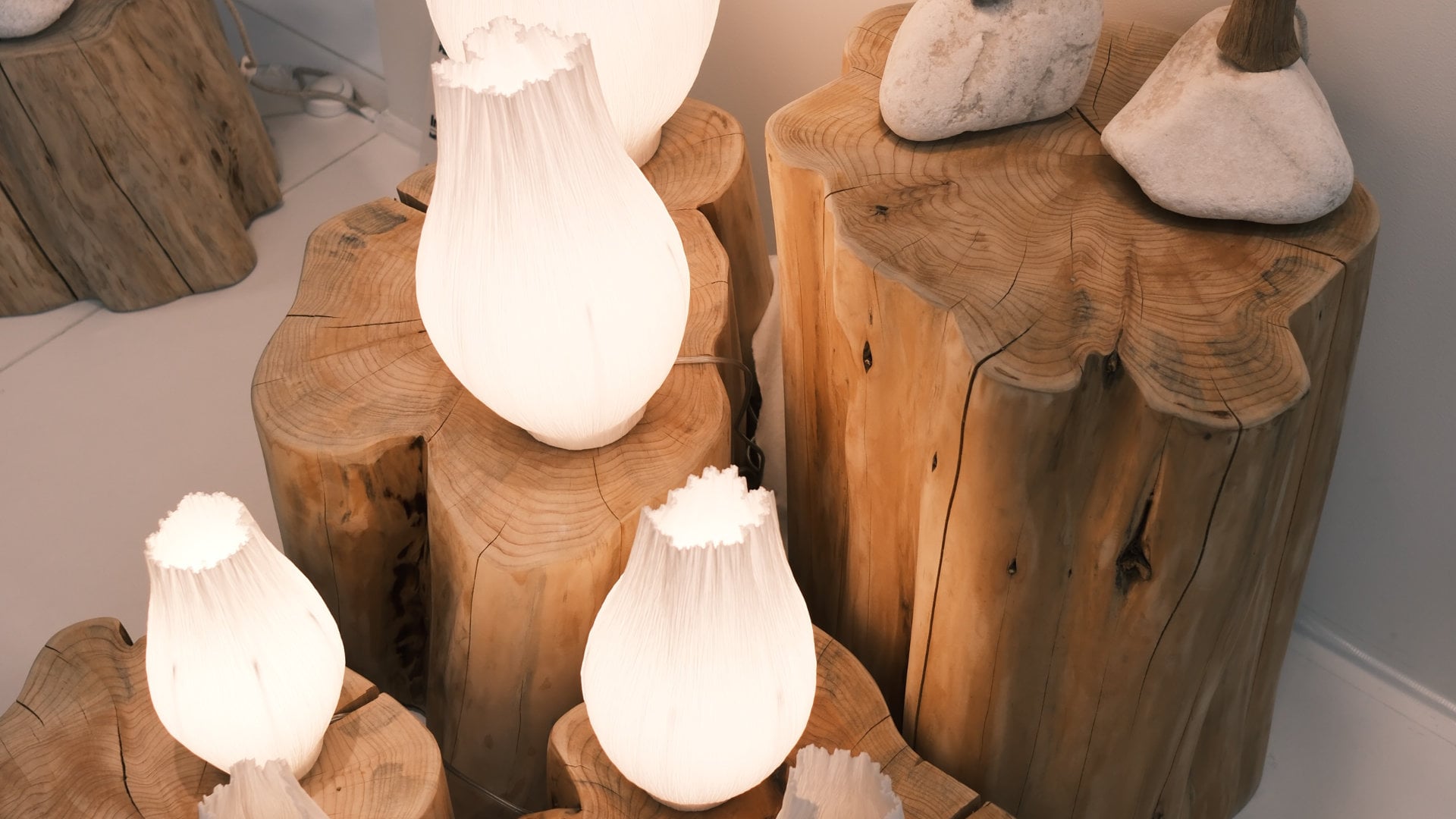
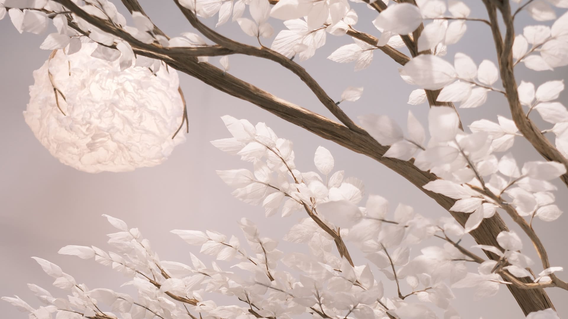
We also saw beautiful examples of traditional techniques carried into contemporary design, from Colombian iraca palm weaving to lighting made with paper mulberry bark cloth from Taiwan. These pieces felt decorative, but they also carried provenance, materiality and a sense of place.
For the home, this reinforces something we have always believed: a few beautifully made pieces can often contribute more to a room than an abundance of trend-led decorative objects.
2. Warmth Through Texture and Form
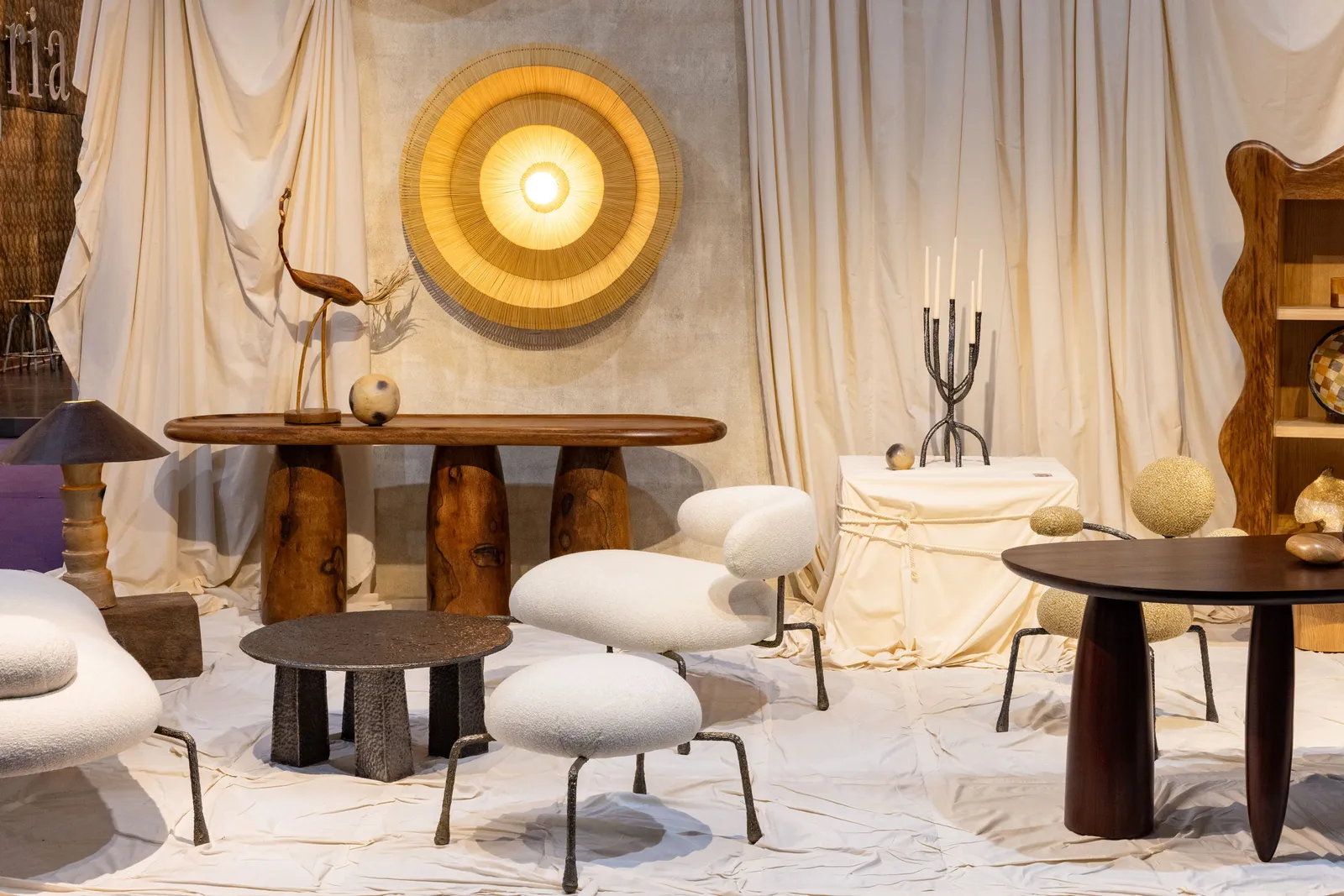
Texture continues to play an important role in creating warmth and visual interest, with quality materials such as wool, velvet, linen, timber, stone and woven fibres layered together.
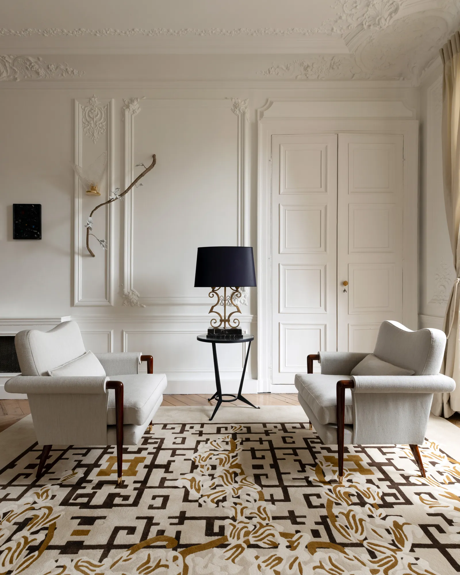
Furniture forms are also continuing to soften, with curved sofas, generous armchairs, rounded tables and upholstered headboards balanced by more sculptural or antique pieces.
For the cooler months, this layered approach feels particularly relevant. It is less about adding more objects and more about choosing materials that invite touch, soften the room and create a greater sense of comfort.
3. Heritage, Reinterpreted
Another direction we loved was the renewed interest in historical references.
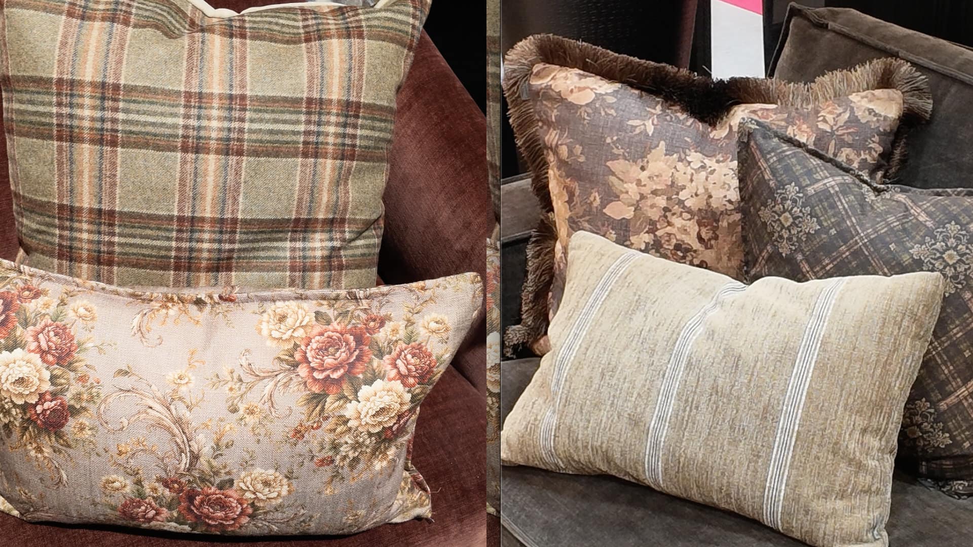
Damasks, brocades, decorative textiles, traditional furniture forms and archival motifs are reappearing, but they are being used with much greater freedom. Rather than recreating a particular period, these influences are being combined with contemporary furniture, cleaner silhouettes and occasional references to the 1960s and 1970s.
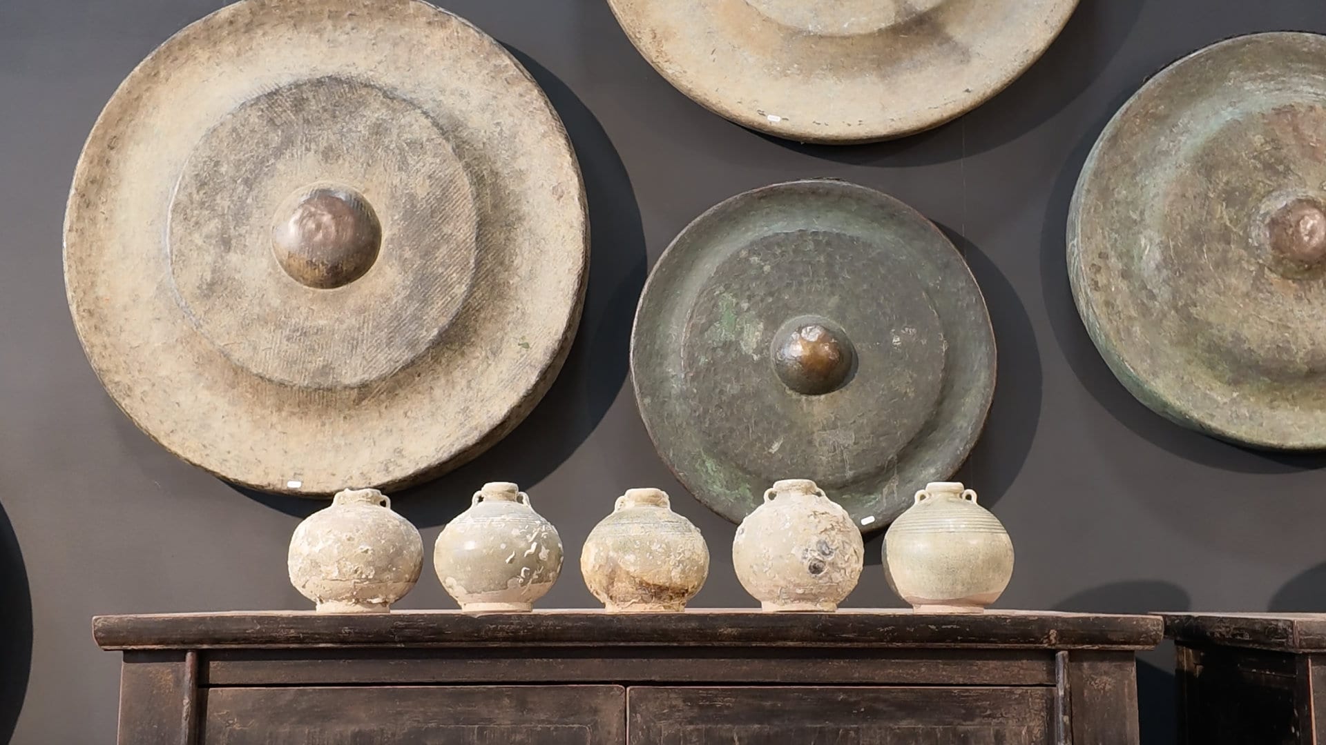
This creates a more nuanced interior language. An antique timber table might sit beneath a contemporary light fitting; a traditional patterned cushion could be styled on a contemporary armchair; an aged cabinet may be paired with chrome, glass or a modern artwork.
Pieces from different eras create contrast, and that contrast gives a room its sense of history and individuality.
4. Richer, Grounded Colours
Colour is becoming deeper and more expressive, although it remains closely tied to nature. The Pulse in Motion theme translates into unexpected, high-energy contrast balanced by deeply grounded earth tones. Here are three of the primary palette combinations seen at the show:
| Palette Trend | Core Colours | The Feeling |
|---|---|---|
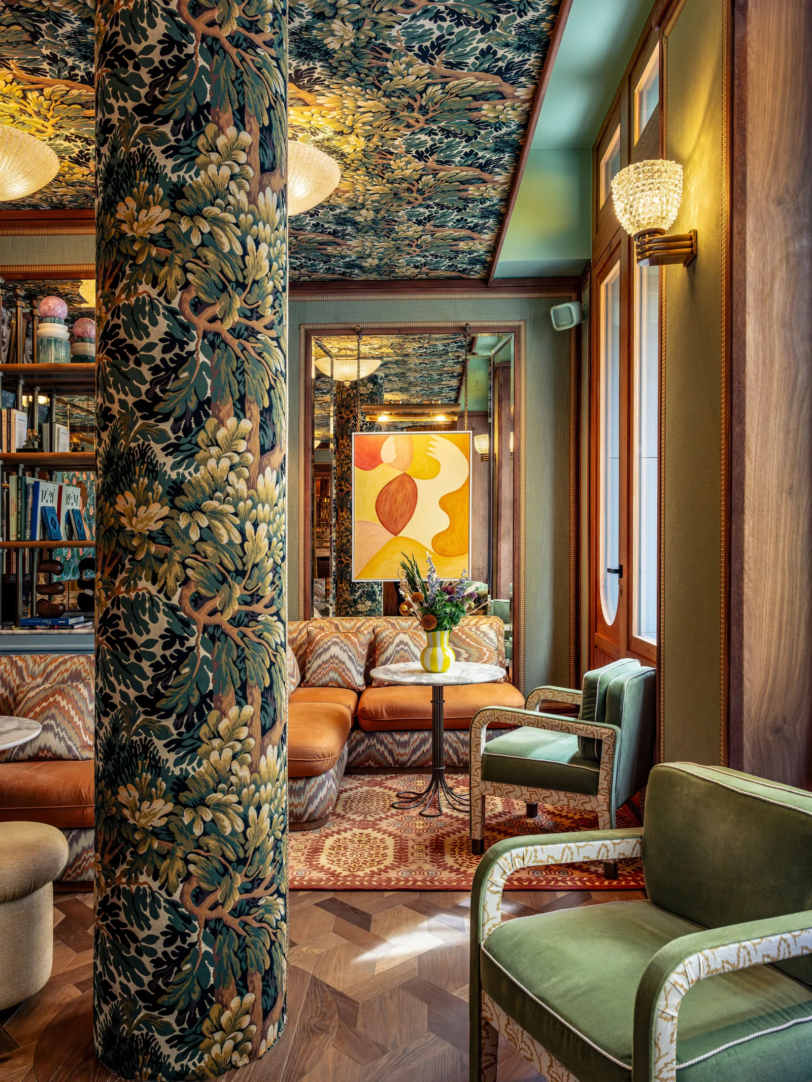
| The New Heritage | Deep burgundy, dark teal and amber gold | Moody, historic and luxurious |
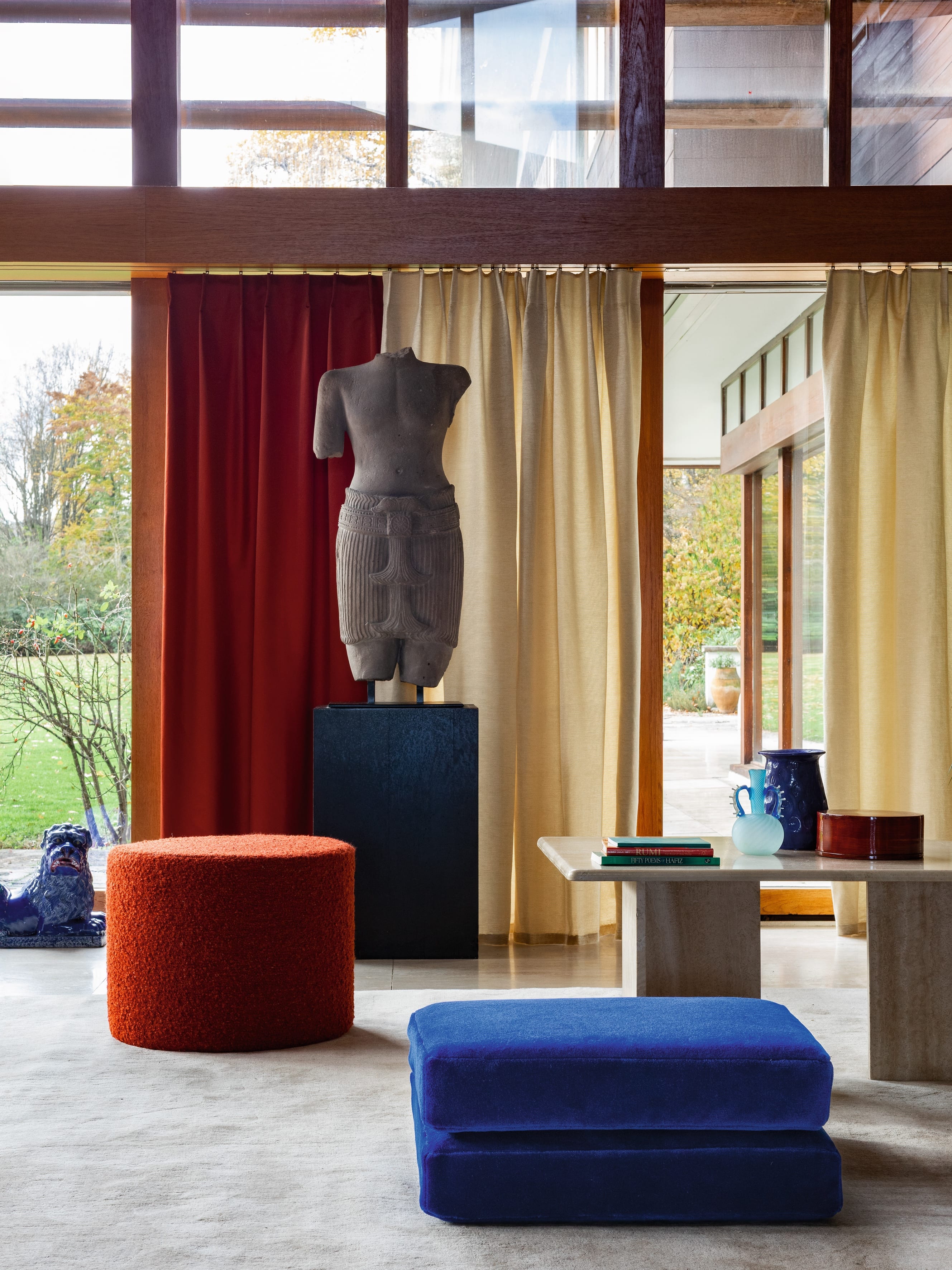
| Retro Kinetic | Rich orange-red, electric blue and high-shine chrome | High-contrast, playful and influenced by the 1960s and 1970s |
| Grounded Biosphere | Moss green, warm ochre and raw terracotta | Calming, organic and highly tactile |
Warm whites, creams, stone and earthy neutrals continue to provide a beautiful foundation, but they are increasingly being joined by burgundy, dark teal, moss and olive green, terracotta, ochre, amber, tobacco brown, orange-red and layered shades of blue.
Some of the most interesting palettes came from combining these tones rather than using them in isolation.
Deep burgundy, dark teal and amber created a rich, almost old-world atmosphere, particularly alongside patina-rich finishes and aged metals. Moss green, ochre and terracotta offered a softer, more grounded direction, while stronger combinations of orange-red, blue and chrome brought in the influence of the 1960s and 1970s.
The key is to allow the colour to feel integrated rather than added as an isolated accent.
5. A More Expressive Interior
Alongside the quieter and more tactile schemes, there was also a clear move towards more expressive decorating.
As mentioned earlier, pattern, reflective surfaces, decorative textiles and pieces from different periods and cultures were being combined with greater confidence. Chrome sat alongside brocade, strong colour appeared beside antique furniture, and mirrored or polished surfaces introduced light against heavier natural materials.
What made these interiors successful was a strong consideration of proportion, colour, material and negative space.
This is a useful way to think about maximalism in the home. It does not necessarily mean filling every surface. It can simply mean allowing more personality into the room and being less concerned with whether every piece belongs to the same decorating language.
6. Bringing these Elements into the Home
Living Room: Bold and Kinetic
The living room embraces the trend towards World Maximalism and sculptural form, creating an energetic yet sophisticated conversational space.
- The palette: Deep burgundy walls paired with an electric blue or rich orange-red accent chair.
- Furniture: Opt for low-slung, organic, conversational seating arrangements. Think curved sofas in heavier textures such as bouclé or ribbed velvet.
- The metallic touch: Introduce high-shine chrome coffee tables or side tables to bounce light and balance the heavier fabric textures.
- Décor: Layer in one standout artisan piece, such as an oversized hand-blown glass vase or an imperfectly glazed ceramic stool.
Bedroom: Warmth and Tactility
For the bedroom, the direction shifts more heavily towards warmth and tactility, focusing on sensory comfort and quiet luxury over busy decoration.
- The palette: Moss green or dark teal on the walls, balanced by linens in raw terracotta and warm ochre.
- The bed: Highly tactile, layered textiles are replacing crisp, minimalist sheets. Instead, mix heavy wool throws, washed linen and tufted cushions.
- Lighting: Use lighting crafted from natural materials to diffuse a warm glow. Materials such as paper mulberry bark cloth or woven iraca palm can help soften the room.
- Forms: Choose bedroom furniture with soft, rounded edges, such as a curved upholstered headboard, to evoke a cocoon-like feeling.
Tabletop: Quiet Craft and Expressive Entertaining
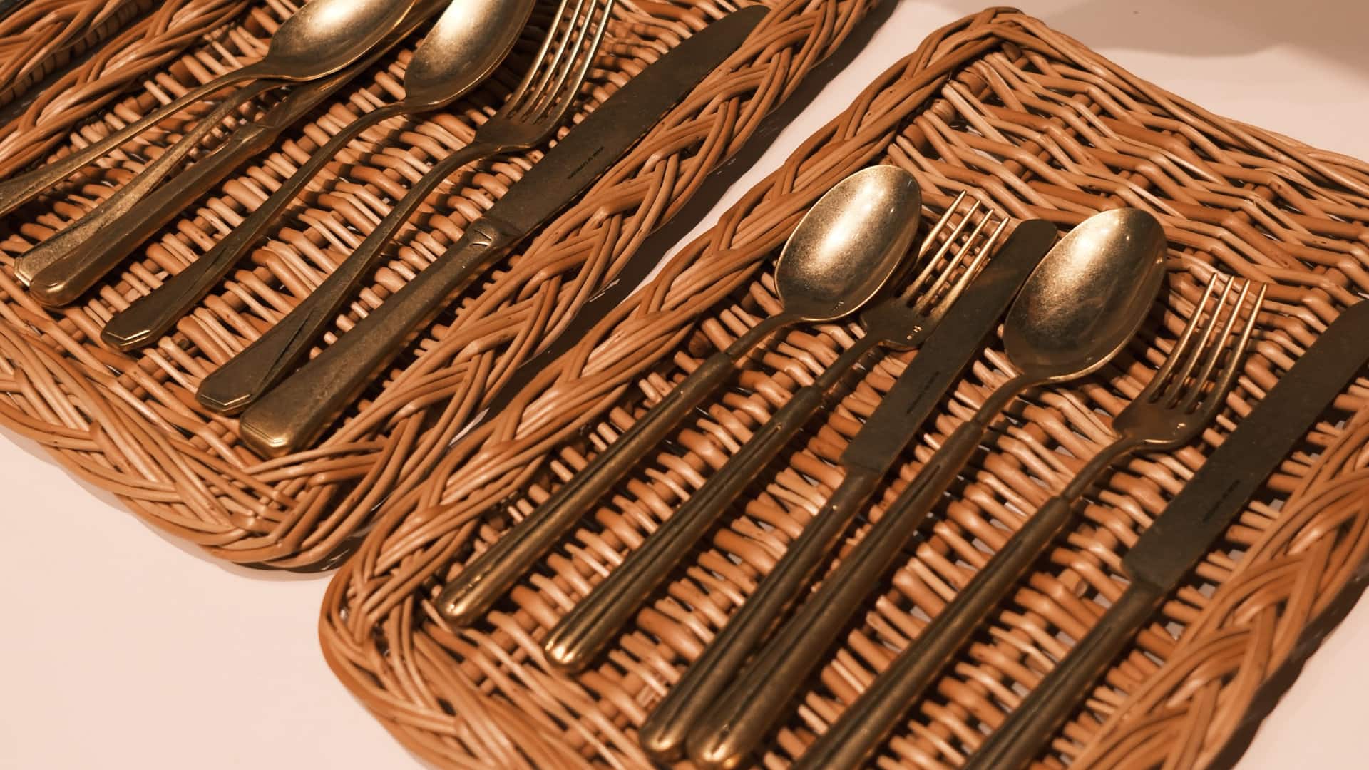
There is also a move towards joyful, eclectic tables, with hand-painted ceramics, unexpected colour combinations, decorative candleholders and a mix of eras and patterns. One of the September 2026 presentations specifically highlighted tabletop joy, with hand-painted ceramics and candleholders designed for abundant, expressive entertaining. The table setting itself is becoming more layered and is designed to create an experience rather than simply provide somewhere to eat.
- Handmade and visibly handmade: Slight irregularities, uneven rims and variations between pieces. The individuality of each piece matters more than perfect coordination.
- Glazes with depth: Crackled, speckled, washed, chalky and layered finishes rather than perfectly uniform surfaces.
- Earth-derived colours: Bone, oyster, chalk, sand, clay, terracotta, tobacco, olive and deep brown.
- Organic shapes: Playful, expressive and irregular forms, generous bowls, footed vessels and mixed pieces that can sit on the table almost as decoration.
- Glassware: Hand-blown, coloured or smoky glass, with ribbed and irregular forms.
- Cutlery: Brushed or aged finishes, warm metals rather than highly polished silver, and sculptural handles with slightly unusual silhouettes.
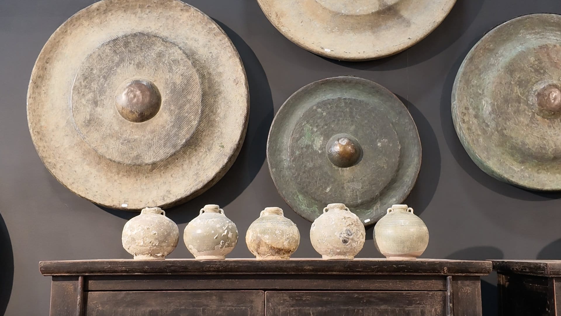
Additional Photos from Maison&Objet